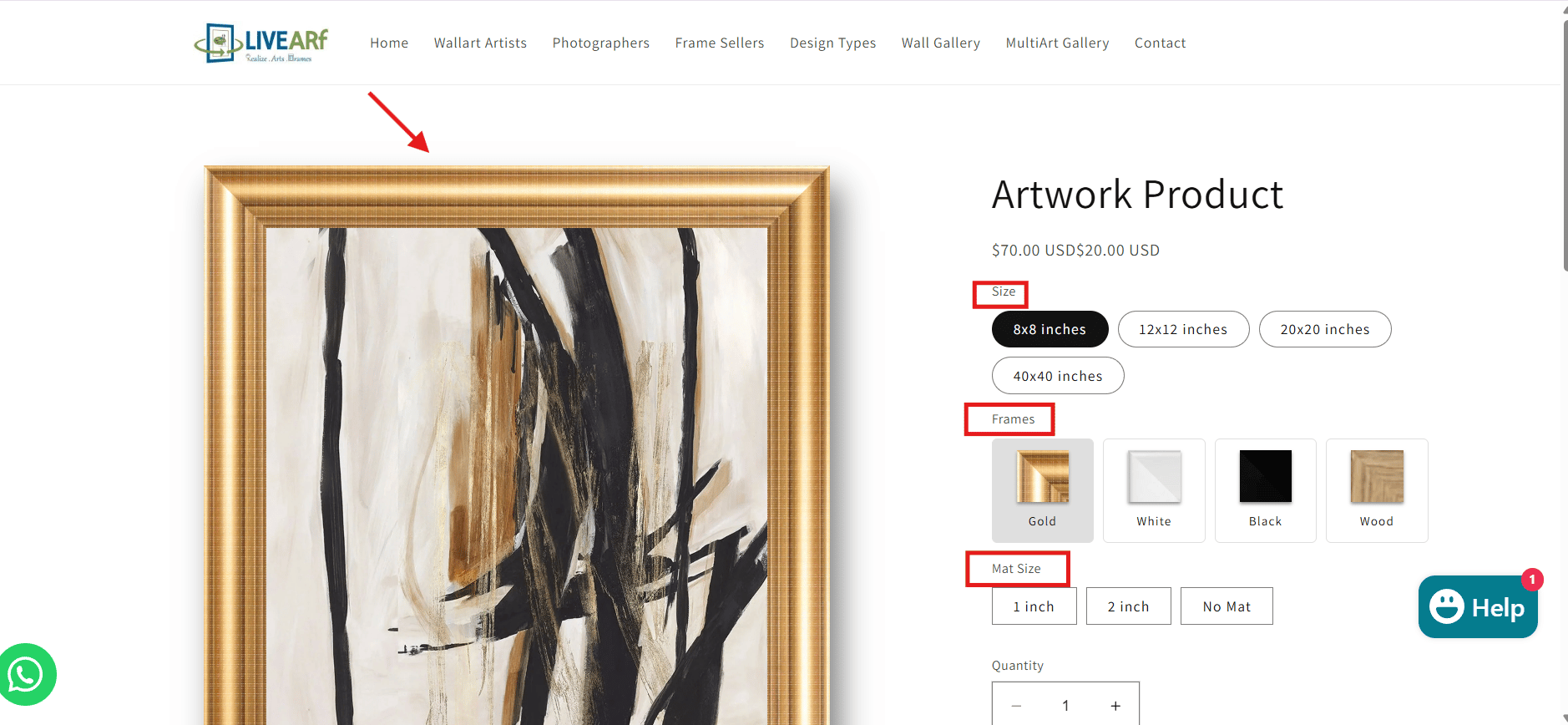
What is the Artwork Component?
The Artwork Component gives customers a live framing experience on your product page. They pick size, frame, and mat — the preview updates instantly. No redirects, no separate tool.| Best for | Customer experience | You configure |
|---|---|---|
| Artists & photographers with pre-made artwork | Live size, frame & mat preview before buying | Options, pricing rules & smart visibility logic |
The Artwork Component uses your existing artwork images. Customers cannot upload their own photos here. If you need customer uploads, use the Upload Component instead.
Accessing the Component
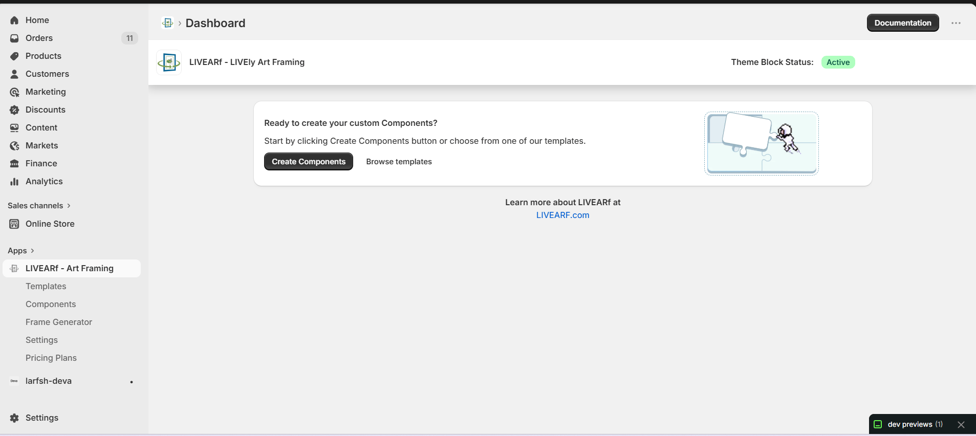
- Open the LIVEARf app from your Shopify admin
- In the left sidebar, click Components
- Select an existing Artwork Component or click Create My Own
- Open the Basic Configuration tab
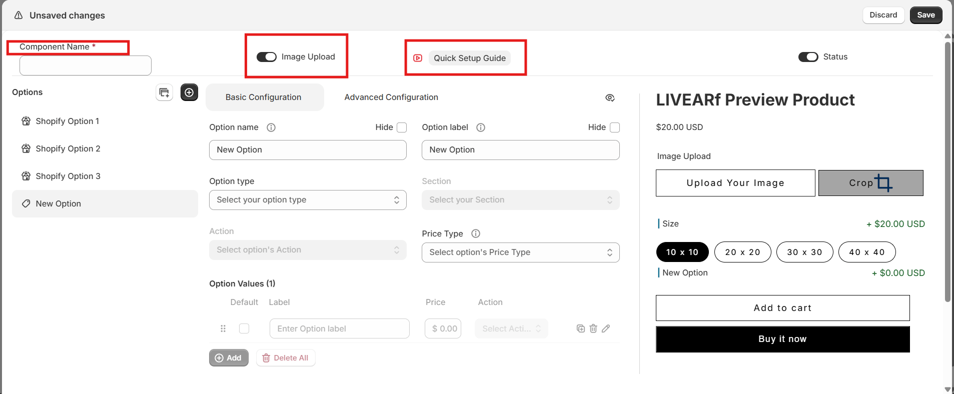
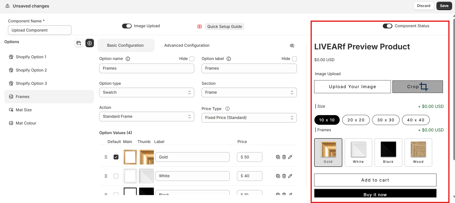
Component Header Settings
| Setting | What it does | Shown to customers? |
|---|---|---|
| Component Name | Internal label to identify this component | No |
| Image Upload | Enables customer image upload. Keep OFF for Artwork Components — artwork is pre-defined | No |
| Component Status | ON = active and linkable to products. OFF = paused without deleting | No |
Options Panel
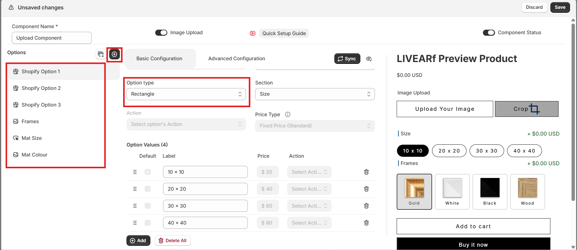
- Shopify Options
- Custom Options
The first three options are automatically inherited from your Shopify product variants — for example, Size.
- Use the eye icon to show or hide each option on the storefront
- Hidden options do not appear in the Preview Product panel
- These cannot be deleted — they come directly from your Shopify product
If your Shopify product has no variants, these slots appear empty. Set up product variants in Shopify first.
Configuring an Option
Click any option name in the list on the left to open its settings. Every option follows the same five steps.Step 1 — Name and Label
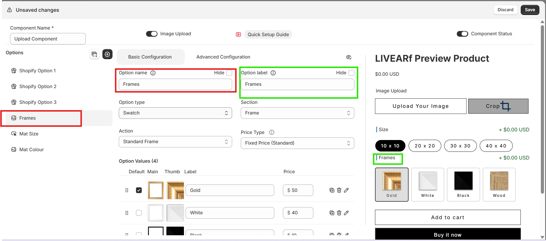
| Field | Purpose | Shown to customers? |
|---|---|---|
| Option Name | Internal reference used in rules and config | No |
| Option Label | Text customers see above the option | Yes |
| Hide toggle | Hides the option from the storefront entirely | — |
Step 2 — Option Type
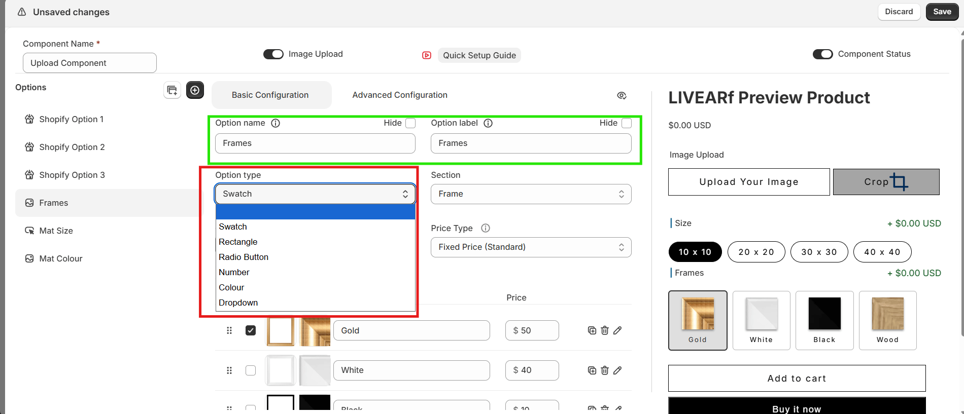
| Type | Best used for |
|---|---|
| Swatch | Frame images or mat colour thumbnails |
| Rectangle | Size options shown as pill buttons |
| Radio Button | Single-choice text selections |
| Dropdown | Long lists of choices |
| Number | Custom numeric input (width, height) |
| Colour | Colour picker for mat colours |
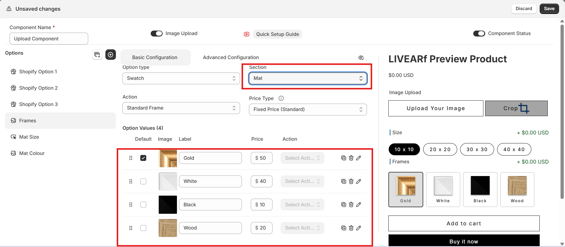
Step 3 — Section
The Section tells LIVEVUE what this option represents and controls how it renders visually.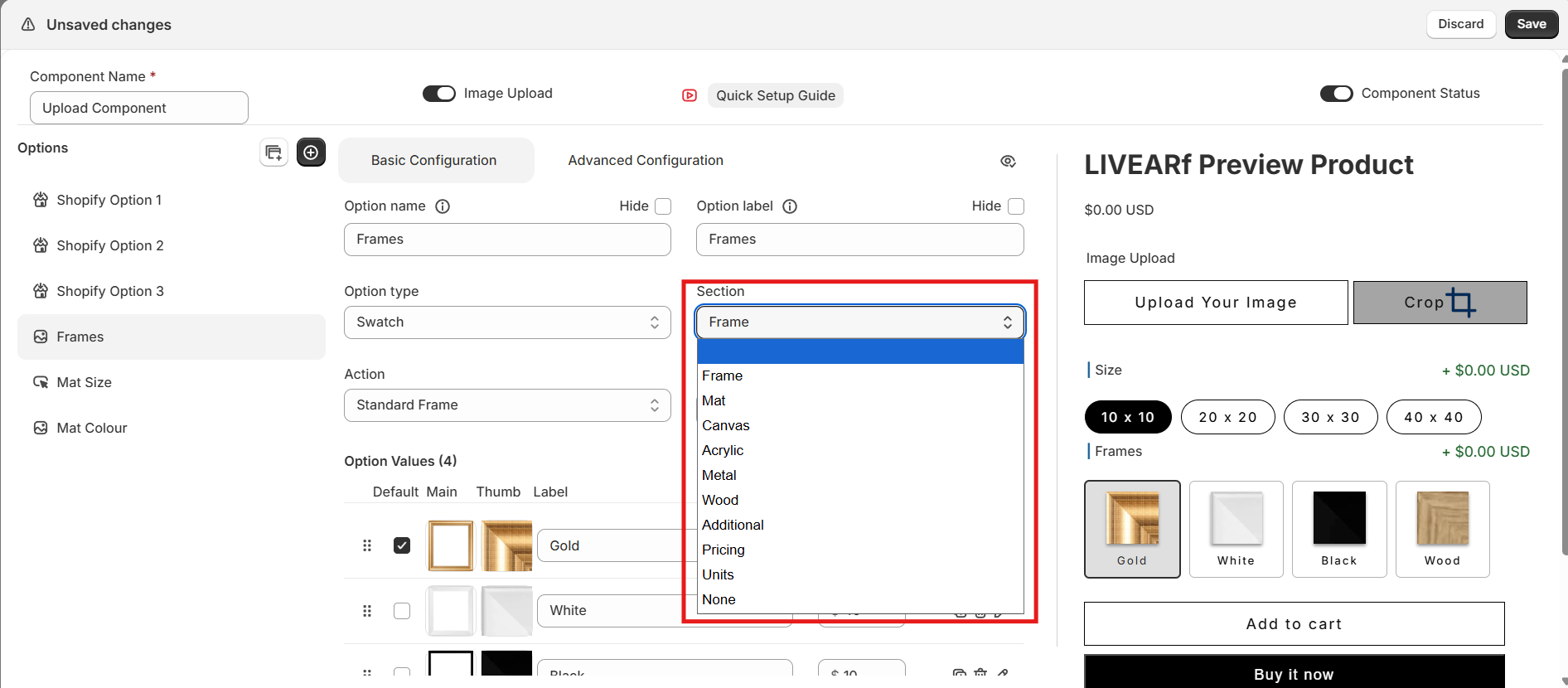
| Section | Purpose |
|---|---|
| Frame | Frame border visualisation and styles |
| Mat | Mat appearance around the artwork |
| Canvas | Canvas wrap rendering styles |
| Acrylic | Acrylic mounting styles |
| Metal | Metal print styles |
| Wood | Wood-based finish styles |
| Custom Size | Custom width and height inputs |
| Custom Mat Size | Custom mat spacing input |
| Pricing | Adds a pricing adjustment |
| Additional | Optional add-ons |
| None | No special visual behaviour |
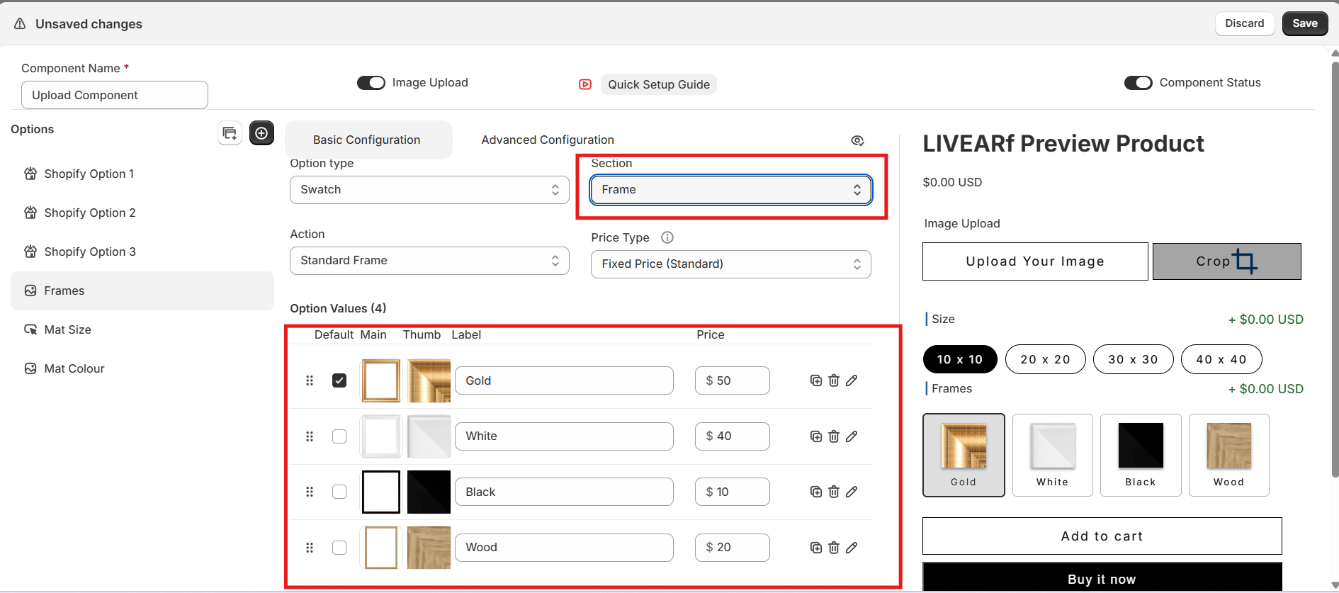
Step 4 — Actions
Some sections unlock an Action dropdown that defines how each value renders visually.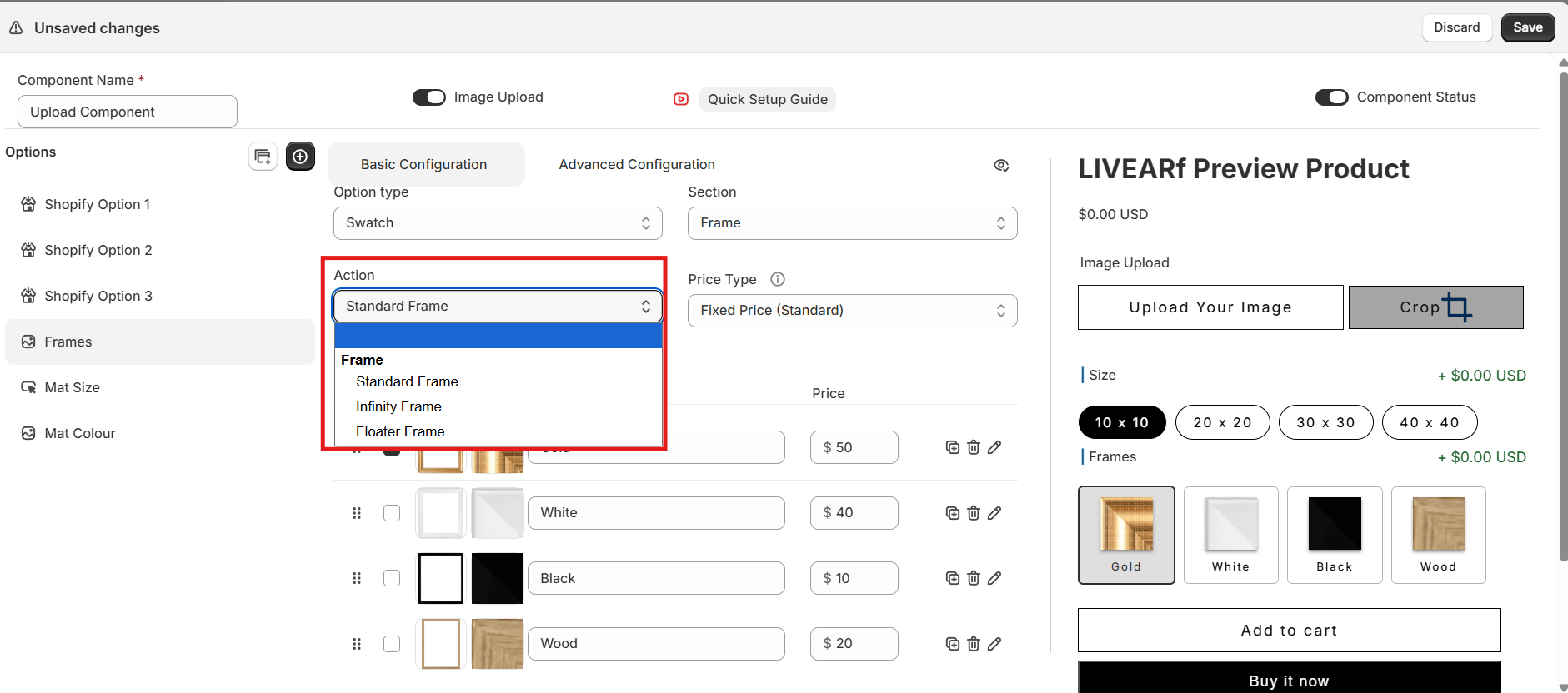
| Section | Available Actions |
|---|---|
| Frame | Standard Frame, Infinity Frame, Floater Frame |
| Canvas | Classic Wrap, Mirror, Colour, Blur |
| Acrylic | Spacers, Mount, Sandwich |
| Metal | Print, Float Mount |
| Wood | Wooden Pallet, Box Board |
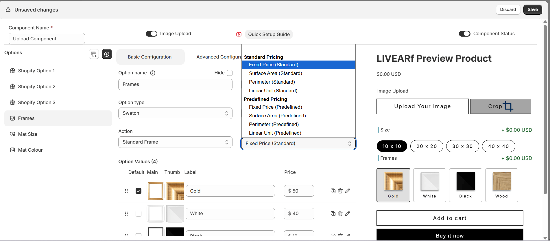
| Pricing | Discount, Margin, Markup |
Sections like Mat do not support Actions — the dropdown is greyed out automatically.
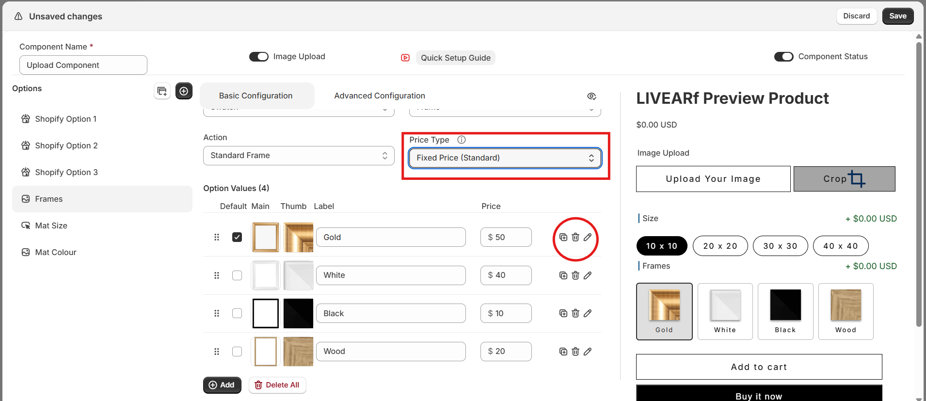
Step 5 — Option Values
Option values are the individual choices customers see — for example Gold, White, Wood, Black for Frames. For each value you can:- Set a Label (text customers see)
- Upload a Main image (used in the live visualisation) and a Thumbnail (shown in the selector)
- Set one value as the Default
- Assign a Price
- Duplicate or Delete the value
Mat, Pricing & Advanced Configuration
- Mat Size & Colour
- Pricing
- Advanced Config — Rules
Mat Size
Controls the spacing between the artwork edge and the frame. Supports single mat and double mat configurations.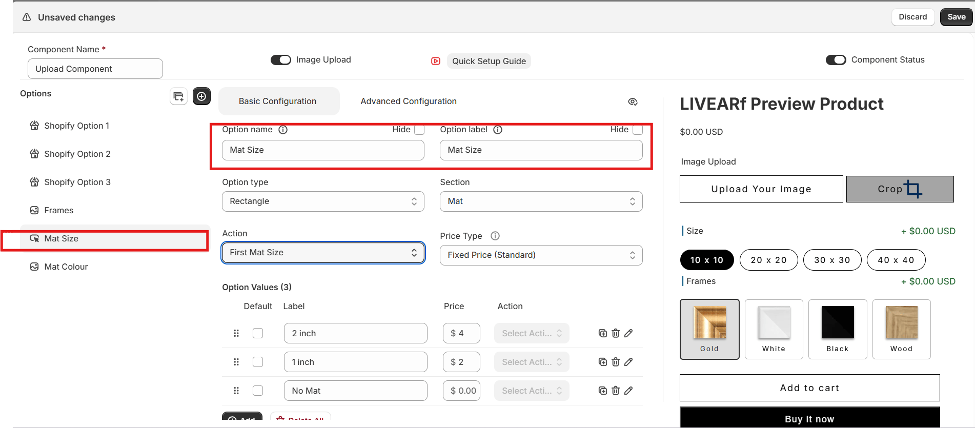
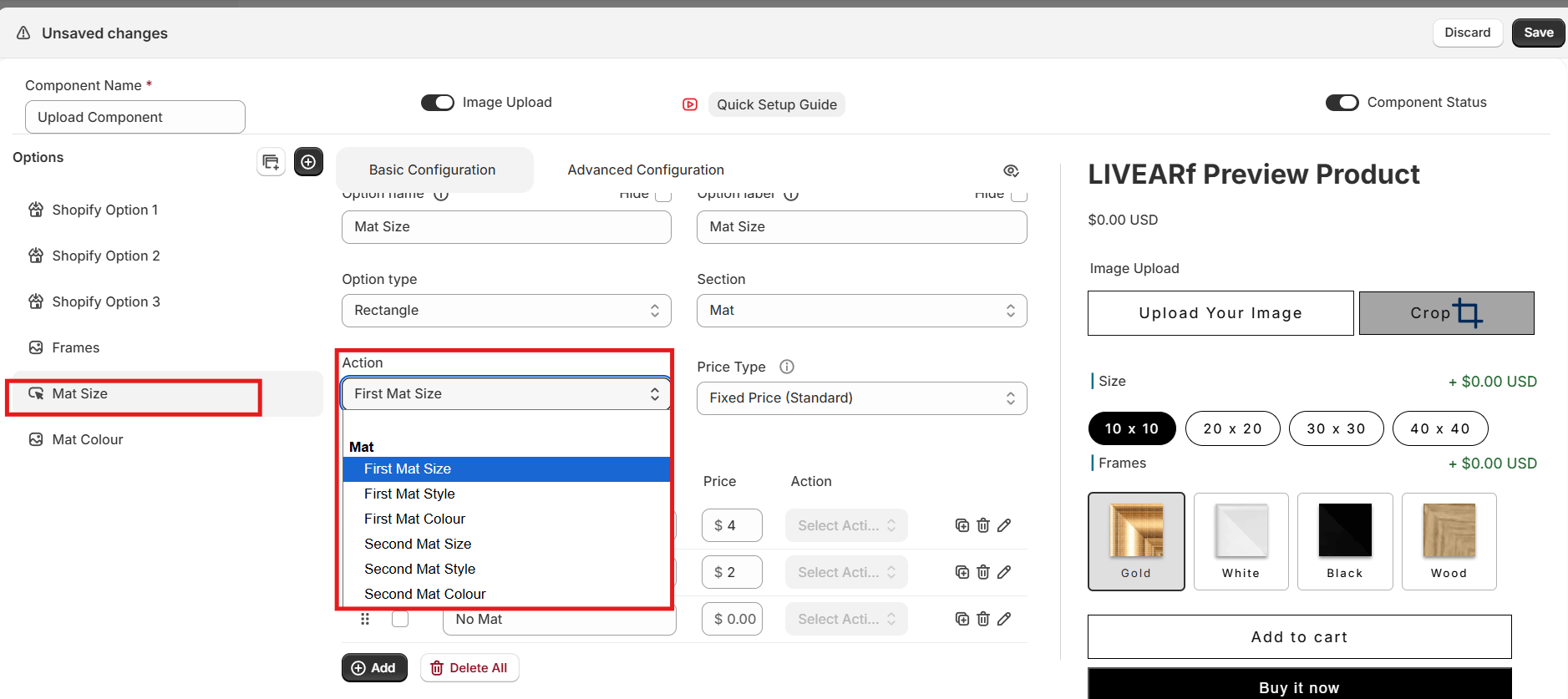
| Sub-setting | Purpose |
|---|---|
| First Mat Size | Width of the primary mat border |
| First Mat Style | Visual style of the primary mat |
| First Mat Colour | Colour of the primary mat |
| Second Mat Size | Width of the secondary mat border |
| Second Mat Style | Visual style of the secondary mat |
| Second Mat Colour | Colour of the secondary mat |
Mat Colour
Controls the visual colour of the mat in the live preview.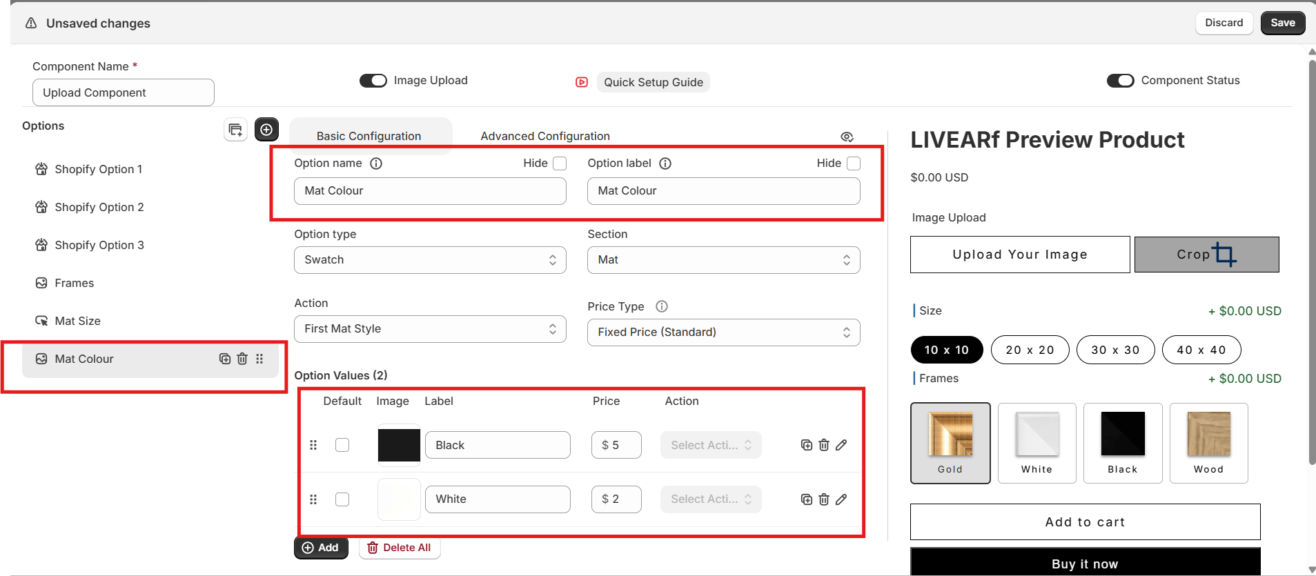
- Uses the same six mat action sub-settings as Mat Size
- Supports all pricing methods
- Use the image icon on each value to upload a colour swatch
- Changes reflect immediately in the Preview Product panel
Preview & Saving
- Option types display correctly — swatches, rectangles, dropdowns all render as expected
- Prices calculate correctly for each combination
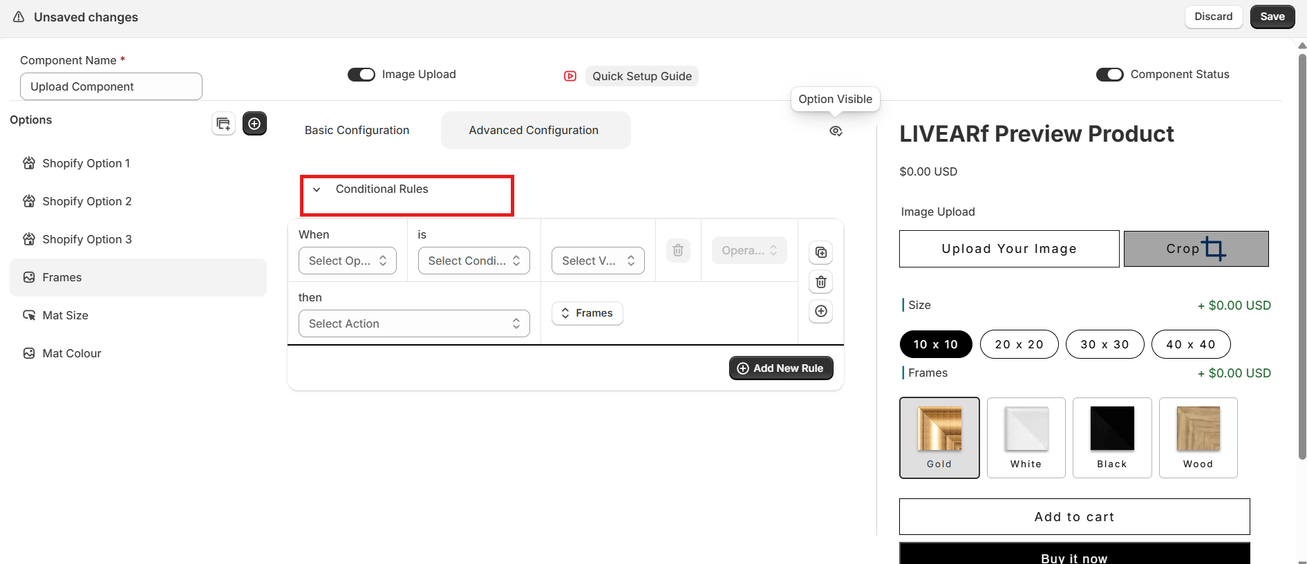
- Conditional rules trigger — options show, hide, and strikeout correctly
- The live artwork preview updates with each selection
- Default values are set for each option
Saved successfully? Your component is ready to link to products.
Linking to Products
Enable the component
Turn Component Status ON and save. The Link button only appears after the component is enabled.
Choose how to apply it
| Option | What it does |
|---|---|
| Selected Collections | All products in chosen Shopify collections |
| Selected Products | Only individually chosen products |
| All Products (LIVEVUE Template Enabled) | Every product already using a LIVEVUE template |
What’s Next?
Upload Component
Let customers upload their own photos and visualise them with your frames.
Frame Generator
Create 2D and 3D frame visuals from your own frame strip images.