> ## Documentation Index
> Fetch the complete documentation index at: https://docs.livearf.com/llms.txt
> Use this file to discover all available pages before exploring further.
# Upload Component
> Let customers upload their own photos and visualise them with your frames and mat options before buying.
## What is the Upload Component?
The Upload Component lets customers **bring their own photo** to your product page, see it framed live, and order with full confidence — before they buy.
| Best for | Customer experience | You configure |
| ------------------------------------------- | ------------------------------------------- | ------------------------------------------- |
| Custom framers & print-on-demand businesses | Upload a photo, preview it framed, then buy | Frame styles, mat options, sizing & pricing |
The Upload Component follows the **same configuration structure** as the Artwork Component. Options, sections, pricing, and conditional rules all work identically. The only difference is a single toggle covered below.
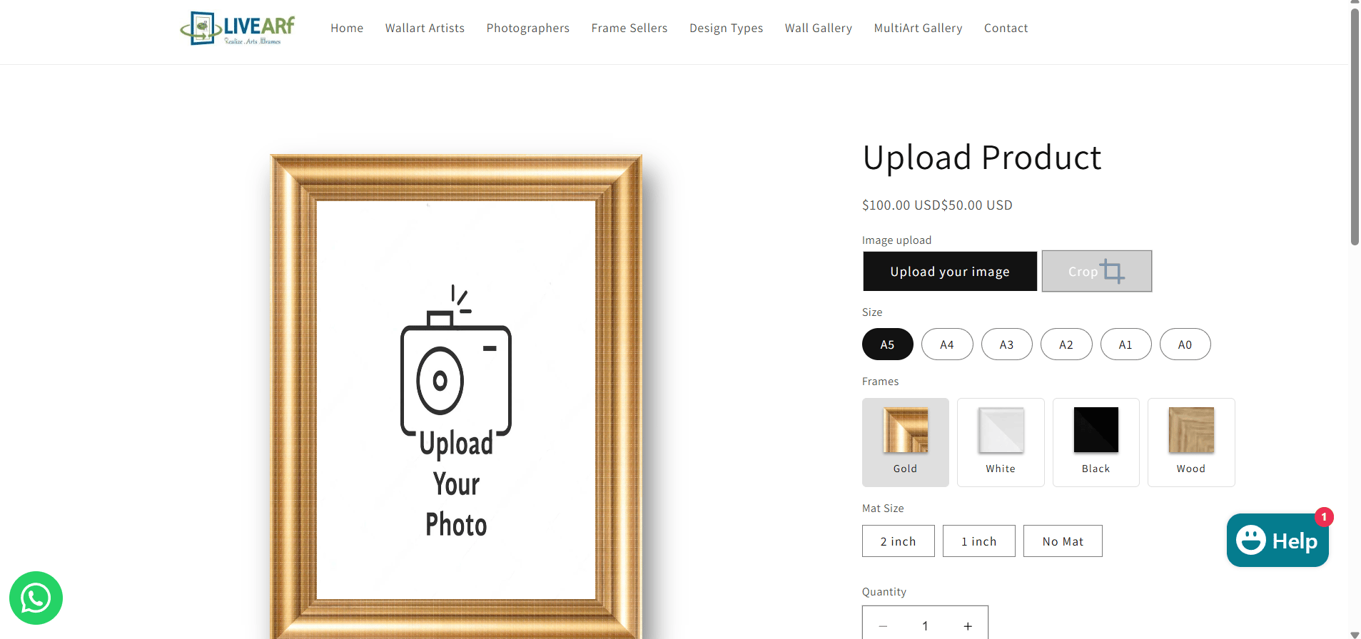
Here is what it looks like on your live store:
 ***
## Artwork Component vs Upload Component
***
## Artwork Component vs Upload Component
 | Situation | Use this |
| ------------------------------------------- | ----------------------------------------------- |
| You sell your own artwork or photography | [Artwork Component](/livevue/artwork-component) |
| Customers frame their own photos | **Upload Component** |
| Print-on-demand with customer images | **Upload Component** |
| Mixed store — your art AND customer uploads | Both, on separate products |
***
## Accessing the Upload Component
| Situation | Use this |
| ------------------------------------------- | ----------------------------------------------- |
| You sell your own artwork or photography | [Artwork Component](/livevue/artwork-component) |
| Customers frame their own photos | **Upload Component** |
| Print-on-demand with customer images | **Upload Component** |
| Mixed store — your art AND customer uploads | Both, on separate products |
***
## Accessing the Upload Component
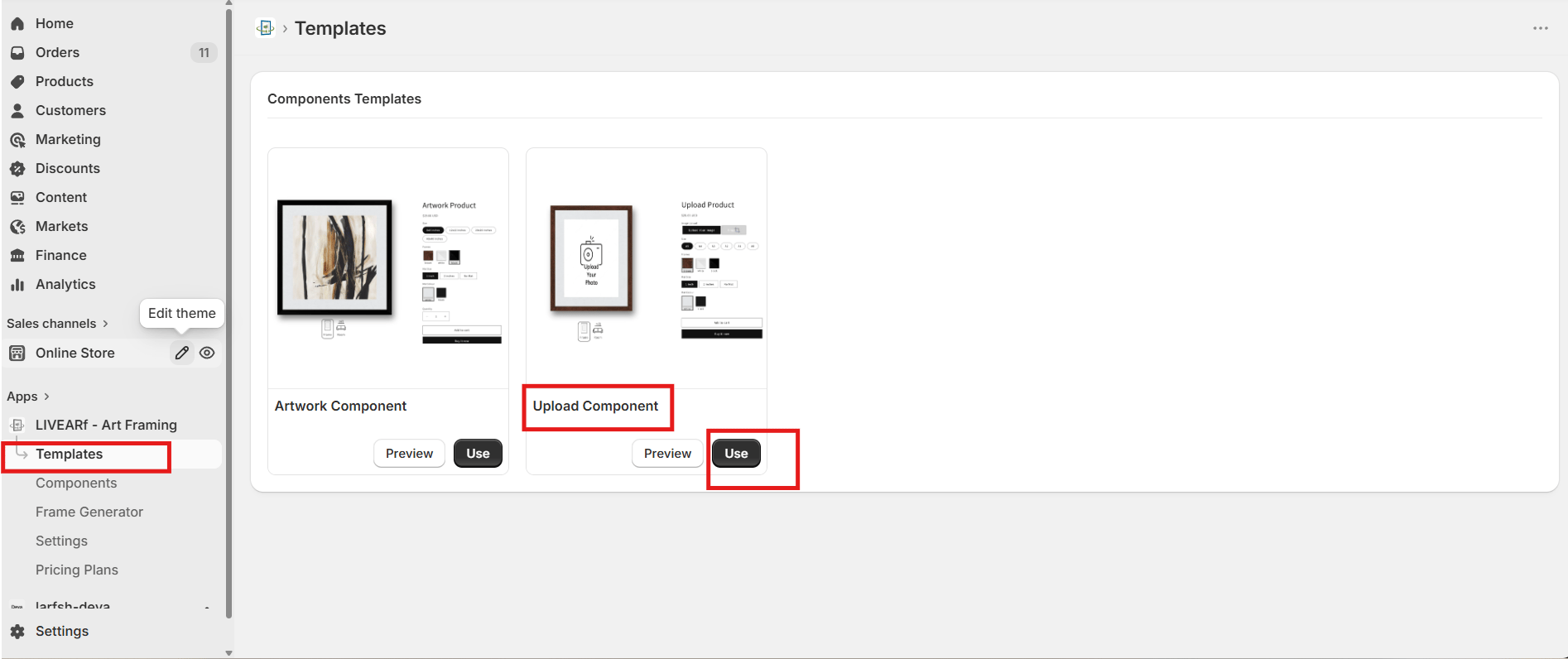 1. Open the **LIVEARf app** from your Shopify admin
2. In the left sidebar, click **Templates**
3. Find the **Upload Component** card and click **Use**
4. Open the **Basic Configuration** tab
***
## The Key Difference — Image Upload Toggle
This is the **only** thing that separates the Upload Component from the Artwork Component.
1. Open the **LIVEARf app** from your Shopify admin
2. In the left sidebar, click **Templates**
3. Find the **Upload Component** card and click **Use**
4. Open the **Basic Configuration** tab
***
## The Key Difference — Image Upload Toggle
This is the **only** thing that separates the Upload Component from the Artwork Component.
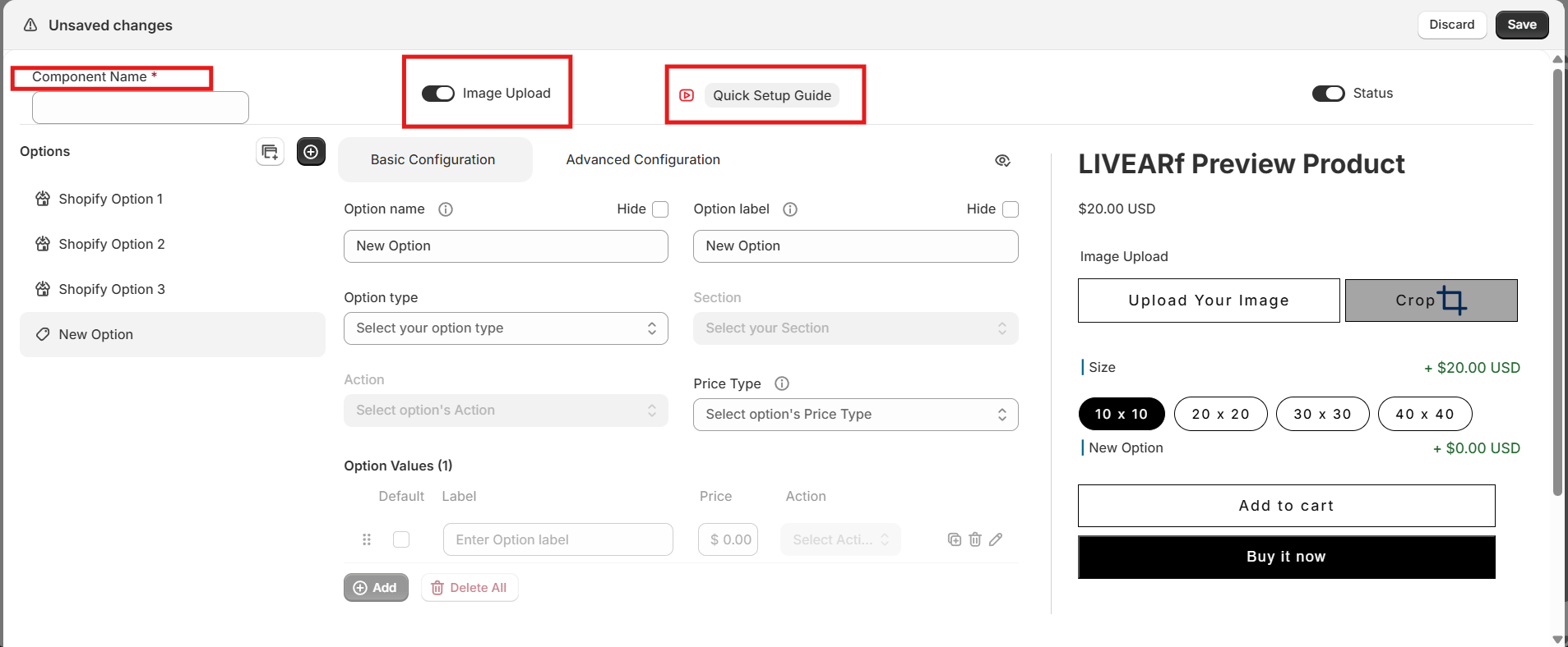 | Setting | Upload Component | Artwork Component |
| ----------------------- | ----------------------------------------------- | ----------------------------------- |
| **Image Upload toggle** | **ON** by default — customers can upload photos | OFF — artwork is pre-defined by you |
Do not turn the Image Upload toggle OFF unless you intentionally want to show only a placeholder image. Without it, customers cannot upload their photo and the component loses its core purpose.
***
## How Customers Experience It
When a customer lands on a product page using the Upload Component, they follow one of two paths:
This is the main intended flow:
1. Customer arrives on the product page
2. They click **Upload Your Image** and select a photo from their device
3. Their photo appears immediately inside the frame preview
4. They adjust size, frame style, and mat options
5. The preview updates in real time with their photo inside the chosen frame
6. They add to cart and place their order
| Setting | Upload Component | Artwork Component |
| ----------------------- | ----------------------------------------------- | ----------------------------------- |
| **Image Upload toggle** | **ON** by default — customers can upload photos | OFF — artwork is pre-defined by you |
Do not turn the Image Upload toggle OFF unless you intentionally want to show only a placeholder image. Without it, customers cannot upload their photo and the component loses its core purpose.
***
## How Customers Experience It
When a customer lands on a product page using the Upload Component, they follow one of two paths:
This is the main intended flow:
1. Customer arrives on the product page
2. They click **Upload Your Image** and select a photo from their device
3. Their photo appears immediately inside the frame preview
4. They adjust size, frame style, and mat options
5. The preview updates in real time with their photo inside the chosen frame
6. They add to cart and place their order
 This path gives customers full confidence in what they are ordering before they buy.
Some customers prefer to explore framing options before committing to a photo:
1. Customer arrives on the product page
2. A **placeholder image** is shown inside the frame on page load
3. They browse frame styles and mat options freely
4. When ready, they upload their photo — it replaces the placeholder instantly
5. They confirm the look and add to cart
Set a high-quality placeholder image that shows off your best frame. Customers who browse first are more likely to convert when the frame already looks great with the placeholder.
***
## Configuration
The Upload Component is configured **exactly the same way** as the Artwork Component. Refer to the sections below for full instructions on each part.
This path gives customers full confidence in what they are ordering before they buy.
Some customers prefer to explore framing options before committing to a photo:
1. Customer arrives on the product page
2. A **placeholder image** is shown inside the frame on page load
3. They browse frame styles and mat options freely
4. When ready, they upload their photo — it replaces the placeholder instantly
5. They confirm the look and add to cart
Set a high-quality placeholder image that shows off your best frame. Customers who browse first are more likely to convert when the frame already looks great with the placeholder.
***
## Configuration
The Upload Component is configured **exactly the same way** as the Artwork Component. Refer to the sections below for full instructions on each part.
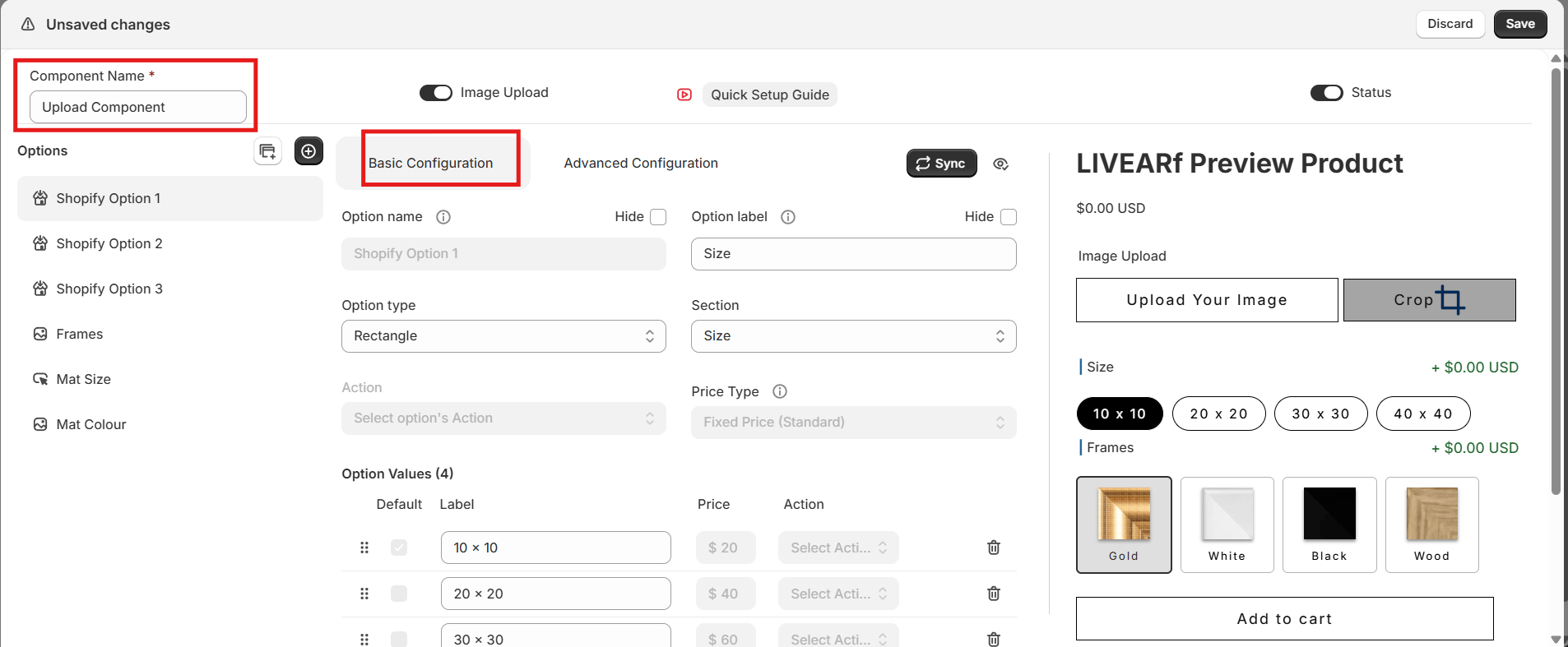 Set the **Component Name**, confirm **Image Upload is ON**, and set **Component Status to ON**.
→ [See Component Header Settings](/livevue/artwork-component#component-header-settings)
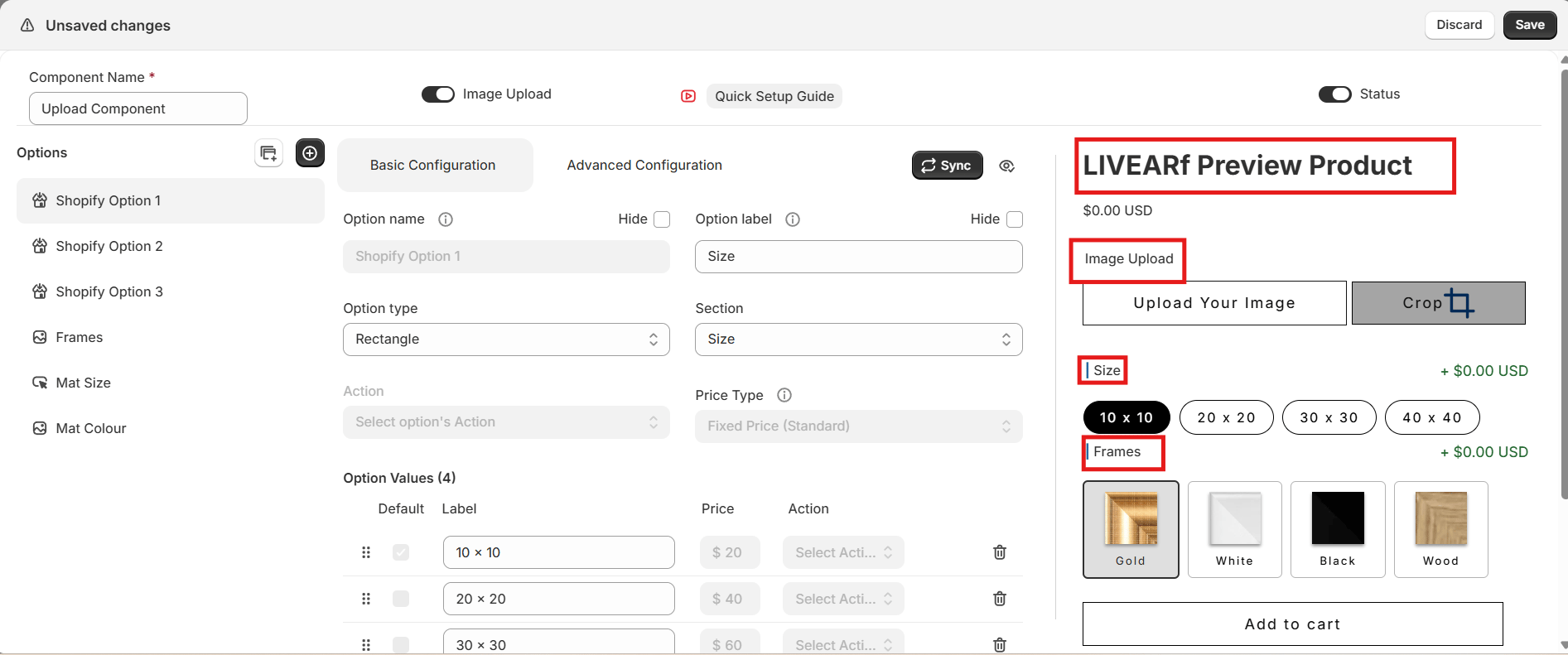
Configure your Shopify-inherited options and the three default custom options — Frames, Mat Size, and Mat Colour.
→ [See Options Panel](/livevue/artwork-component#options-panel)
Configure single or double mat spacing, mat styles, and mat colour swatches.
→ [See Mat Size & Colour](/livevue/artwork-component#mat-size--colour)
All eight pricing methods — Fixed, Surface Area, Perimeter, and Linear Unit across Standard and Predefined — are available here.
→ [See Pricing](/livevue/artwork-component#pricing)
Use WHEN / THEN rules to show, hide, or strikeout options based on customer selections.
→ [See Conditional Rules](/livevue/artwork-component#advanced-config--rules)
***
## Linking to Products
Turn **Component Status ON** and save all changes. The Link button only appears once the component is enabled.
Click **Link** in the top-right corner of the configuration screen.
| Option | What it does |
| ------------------------------------------- | ---------------------------------------------- |
| **Selected Collections** | All products in chosen Shopify collections |
| **Selected Products** | Only individually chosen products |
| **All Products (LIVEVUE Template Enabled)** | Every product already using a LIVEVUE template |
Click **Link** to confirm.
Go to **LIVEARf → Components**. Your component shows the number of linked products with a status of **Active**.
***
## Tips for Upload Component Merchants
Set a high-quality placeholder image that showcases your best frame. Customers who browse before uploading convert better when the page already looks great.
Use conditional rules to hide frame styles that don't suit certain sizes. This reduces confusion and prevents mismatched orders.
If an order comes through without a customer image attached, follow up immediately via the order notes in Shopify. Always check that the upload step completed before fulfilling.
***
## What's Next?
Create 2D and 3D frame visuals from your own frame strip images.
Set up framing options for your own pre-made artwork.
Set the **Component Name**, confirm **Image Upload is ON**, and set **Component Status to ON**.
→ [See Component Header Settings](/livevue/artwork-component#component-header-settings)
Configure your Shopify-inherited options and the three default custom options — Frames, Mat Size, and Mat Colour.
→ [See Options Panel](/livevue/artwork-component#options-panel)
Configure single or double mat spacing, mat styles, and mat colour swatches.
→ [See Mat Size & Colour](/livevue/artwork-component#mat-size--colour)
All eight pricing methods — Fixed, Surface Area, Perimeter, and Linear Unit across Standard and Predefined — are available here.
→ [See Pricing](/livevue/artwork-component#pricing)
Use WHEN / THEN rules to show, hide, or strikeout options based on customer selections.
→ [See Conditional Rules](/livevue/artwork-component#advanced-config--rules)
***
## Linking to Products
Turn **Component Status ON** and save all changes. The Link button only appears once the component is enabled.
Click **Link** in the top-right corner of the configuration screen.
| Option | What it does |
| ------------------------------------------- | ---------------------------------------------- |
| **Selected Collections** | All products in chosen Shopify collections |
| **Selected Products** | Only individually chosen products |
| **All Products (LIVEVUE Template Enabled)** | Every product already using a LIVEVUE template |
Click **Link** to confirm.
Go to **LIVEARf → Components**. Your component shows the number of linked products with a status of **Active**.
***
## Tips for Upload Component Merchants
Set a high-quality placeholder image that showcases your best frame. Customers who browse before uploading convert better when the page already looks great.
Use conditional rules to hide frame styles that don't suit certain sizes. This reduces confusion and prevents mismatched orders.
If an order comes through without a customer image attached, follow up immediately via the order notes in Shopify. Always check that the upload step completed before fulfilling.
***
## What's Next?
Create 2D and 3D frame visuals from your own frame strip images.
Set up framing options for your own pre-made artwork.