> ## Documentation Index
> Fetch the complete documentation index at: https://docs.livearf.com/llms.txt
> Use this file to discover all available pages before exploring further.
# Settings
> Configure global behaviour for LIVEVUE across your Shopify store.
## Overview
Settings controls global behaviour across all your LIVEVUE components and products. Go to **LIVEARf → Settings** in your Shopify admin. You will see six tabs on the left — click any tab to configure that section. Changes reflect immediately in the **Preview Area** on the right.
***
## Settings Tabs
The General tab controls language, size display, artwork image selection, and custom size/mat limits.
***
### Language
 | Setting | What it does |
| ------------------- | ------------------------------------------------------------ |
| **Select Language** | Sets the display language for storefront labels and messages |
Available languages: English, French, Tamil, Turkish, Swedish, Português (Brasil).
***
### Size Display
Controls how product dimensions are shown to customers on the product page.
| Setting | What it does |
| ------------------- | ------------------------------------------------------------ |
| **Select Language** | Sets the display language for storefront labels and messages |
Available languages: English, French, Tamil, Turkish, Swedish, Português (Brasil).
***
### Size Display
Controls how product dimensions are shown to customers on the product page.

 | Option | What it shows |
| --------------------------------------------------- | ----------------------------------------- |
| **Print Image Size** | Artwork dimensions only — e.g. 8×10 print |
| **Outer Framed / UnFramed — Finished Product Size** | Full outer dimensions including the frame |
***
### Clean Artwork Image
Defines which product image is used as the clean artwork for virtual framing and room previews.
| Option | What it shows |
| --------------------------------------------------- | ----------------------------------------- |
| **Print Image Size** | Artwork dimensions only — e.g. 8×10 print |
| **Outer Framed / UnFramed — Finished Product Size** | Full outer dimensions including the frame |
***
### Clean Artwork Image
Defines which product image is used as the clean artwork for virtual framing and room previews.

 | Option | When to use |
| ---------------- | --------------------------------------------------------------- |
| **First Image** | Your first product image is the clean artwork |
| **Second Image** | Second image is a clean version without background distractions |
| **Last Image** | Last image in the product gallery is the clean artwork |
Use a clean, high-resolution image with no background clutter as your designated artwork image. This is what customers see in the framing preview and room view.
***
### Custom Size & Mat Selection
Sets the allowed minimum and maximum values when customers enter custom sizes or mat dimensions.
| Option | When to use |
| ---------------- | --------------------------------------------------------------- |
| **First Image** | Your first product image is the clean artwork |
| **Second Image** | Second image is a clean version without background distractions |
| **Last Image** | Last image in the product gallery is the clean artwork |
Use a clean, high-resolution image with no background clutter as your designated artwork image. This is what customers see in the framing preview and room view.
***
### Custom Size & Mat Selection
Sets the allowed minimum and maximum values when customers enter custom sizes or mat dimensions.
 **Custom Size Selection:**
| Field | Purpose |
| ---------------------------- | ----------------------------------------- |
| **One Side Min (W/H/L)** | Minimum value for the primary dimension |
| **One Side Max (W/H/L)** | Maximum value for the primary dimension |
| **Another Side Min (W/H/L)** | Minimum value for the secondary dimension |
| **Another Side Max (W/H/L)** | Maximum value for the secondary dimension |
**Custom Mat Selection:**
| Field | Purpose |
| -------------------- | ------------------------ |
| **Min / Max Width** | Allowed mat width range |
| **Min / Max Height** | Allowed mat height range |
**Toggle options:**
| Toggle | What it enables |
| --------------------------- | ----------------------------------------------------- |
| **Printing Material Size** | Includes material size in the custom size calculation |
| **Mat (Single / Double)** | Enables single or double mat configuration |
| **Frame** | Includes frame dimensions |
| **Overall Outer Dimension** | Shows total outer dimension to customers |
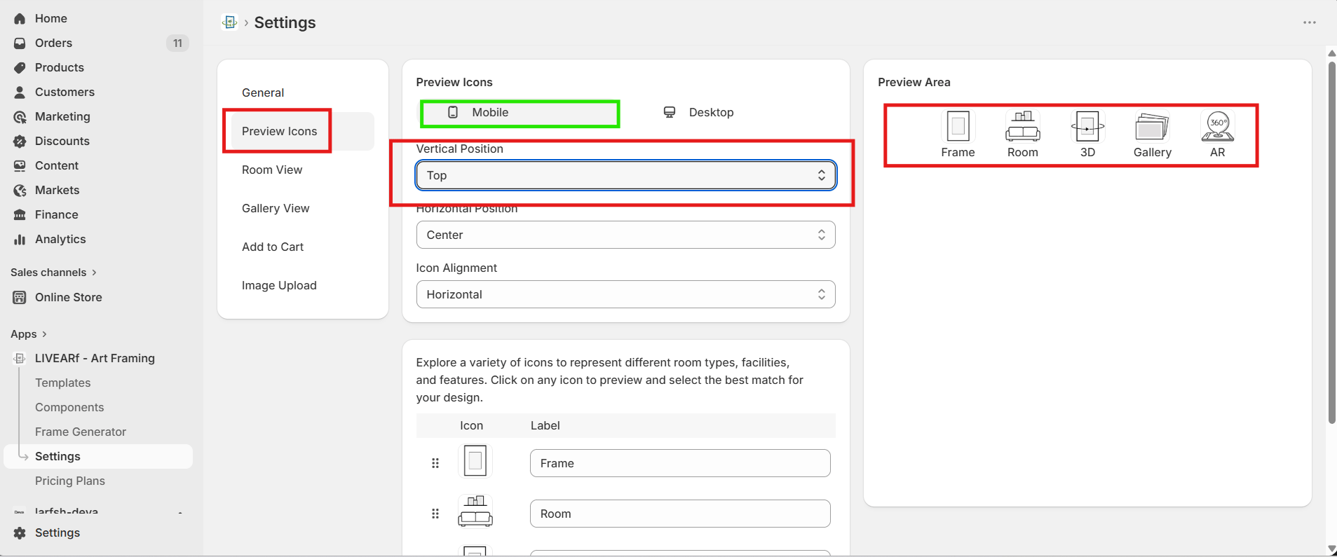
Controls the position and alignment of the preview icons (Frame, Room, 3D, Gallery, AR) on your product page. Configure separately for Mobile and Desktop.
***
### Icons — Top Position
**Custom Size Selection:**
| Field | Purpose |
| ---------------------------- | ----------------------------------------- |
| **One Side Min (W/H/L)** | Minimum value for the primary dimension |
| **One Side Max (W/H/L)** | Maximum value for the primary dimension |
| **Another Side Min (W/H/L)** | Minimum value for the secondary dimension |
| **Another Side Max (W/H/L)** | Maximum value for the secondary dimension |
**Custom Mat Selection:**
| Field | Purpose |
| -------------------- | ------------------------ |
| **Min / Max Width** | Allowed mat width range |
| **Min / Max Height** | Allowed mat height range |
**Toggle options:**
| Toggle | What it enables |
| --------------------------- | ----------------------------------------------------- |
| **Printing Material Size** | Includes material size in the custom size calculation |
| **Mat (Single / Double)** | Enables single or double mat configuration |
| **Frame** | Includes frame dimensions |
| **Overall Outer Dimension** | Shows total outer dimension to customers |
Controls the position and alignment of the preview icons (Frame, Room, 3D, Gallery, AR) on your product page. Configure separately for Mobile and Desktop.
***
### Icons — Top Position
 ### Icons — Bottom Position
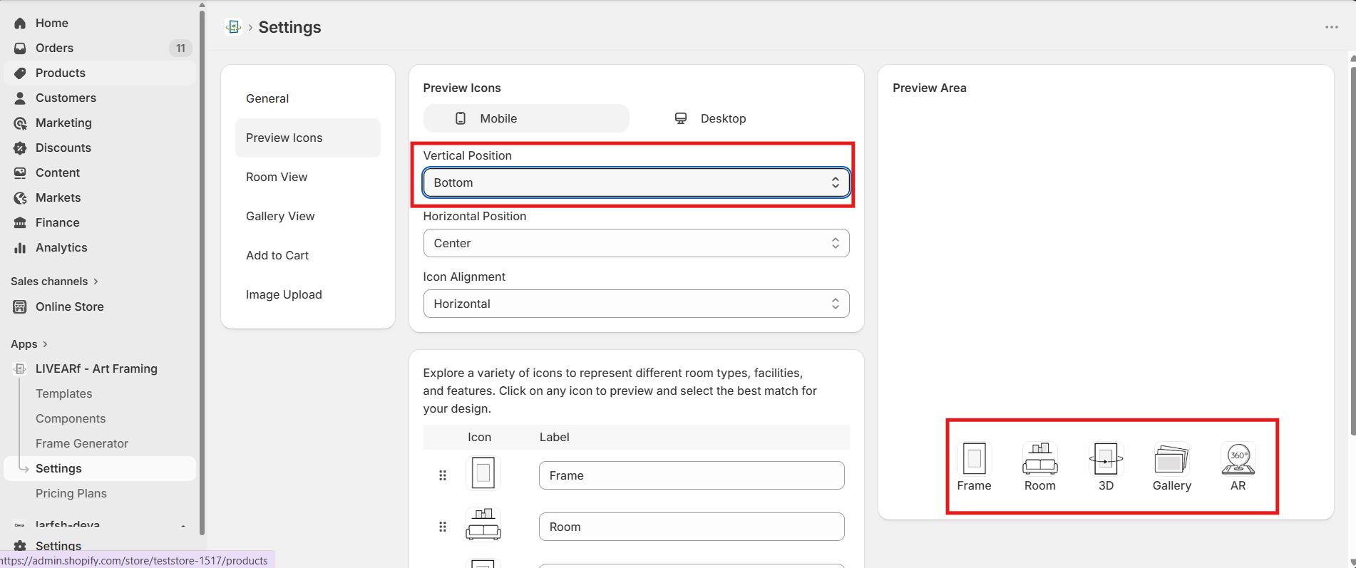 ***
### Position Controls
| Setting | Options | What it does |
| ----------------------- | --------------------- | ------------------------------------------------------- |
| **Device** | Mobile / Desktop | Configure each device independently |
| **Vertical Position** | Top / Bottom | Places the icon bar at the top or bottom of the preview |
| **Horizontal Position** | Left / Center / Right | Aligns the icon bar horizontally |
| **Icon Alignment** | Horizontal / Vertical | Arranges icons in a row or a column |
**Available icons:** Frame, Room, 3D, Gallery, AR
The Preview Area updates live as you change position settings. Verify on both Mobile and Desktop before saving.
Controls the room preview experience — feature toggles, room image categories, and per-room line size.
***
### Position Controls
| Setting | Options | What it does |
| ----------------------- | --------------------- | ------------------------------------------------------- |
| **Device** | Mobile / Desktop | Configure each device independently |
| **Vertical Position** | Top / Bottom | Places the icon bar at the top or bottom of the preview |
| **Horizontal Position** | Left / Center / Right | Aligns the icon bar horizontally |
| **Icon Alignment** | Horizontal / Vertical | Arranges icons in a row or a column |
**Available icons:** Frame, Room, 3D, Gallery, AR
The Preview Area updates live as you change position settings. Verify on both Mobile and Desktop before saving.
Controls the room preview experience — feature toggles, room image categories, and per-room line size.
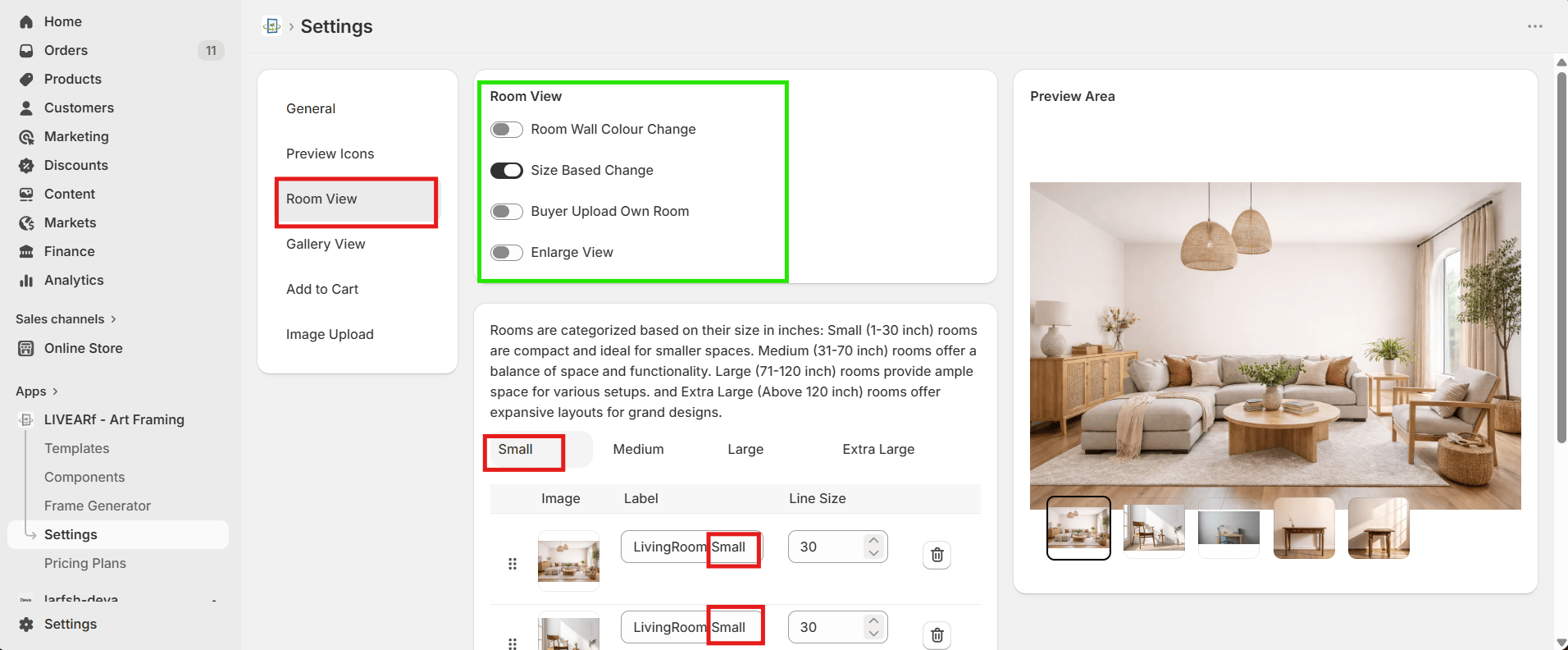 ***
### Feature Toggles
| Feature | What it does |
| --------------------------- | ----------------------------------------------------------- |
| **Room Wall Colour Change** | Lets customers change the wall colour in the room preview |
| **Size Based Change** | Automatically switches the room scene based on artwork size |
| **Buyer Upload Own Room** | Allows customers to upload their own room photo |
| **Enlarge View** | Enables a full-screen expanded room preview |
***
### Room Categories
Room images are organised by artwork size. Each category displays automatically when the artwork matches that size range.
| Category | Size Range |
| --------------- | -------------- |
| **Small** | 1 – 30 inch |
| **Medium** | 31 – 70 inch |
| **Large** | 71 – 120 inch |
| **Extra Large** | Above 120 inch |
For each room image, set the **Label** (display name) and **Line Size** (visual line thickness used in that room scene).
Upload at least one room image per category so customers always see a relevant room regardless of the artwork size they select.
Controls the gallery preview position and default image. Configure separately for Mobile and Desktop.
***
### Feature Toggles
| Feature | What it does |
| --------------------------- | ----------------------------------------------------------- |
| **Room Wall Colour Change** | Lets customers change the wall colour in the room preview |
| **Size Based Change** | Automatically switches the room scene based on artwork size |
| **Buyer Upload Own Room** | Allows customers to upload their own room photo |
| **Enlarge View** | Enables a full-screen expanded room preview |
***
### Room Categories
Room images are organised by artwork size. Each category displays automatically when the artwork matches that size range.
| Category | Size Range |
| --------------- | -------------- |
| **Small** | 1 – 30 inch |
| **Medium** | 31 – 70 inch |
| **Large** | 71 – 120 inch |
| **Extra Large** | Above 120 inch |
For each room image, set the **Label** (display name) and **Line Size** (visual line thickness used in that room scene).
Upload at least one room image per category so customers always see a relevant room regardless of the artwork size they select.
Controls the gallery preview position and default image. Configure separately for Mobile and Desktop.
 ***
| Setting | Options | What it does |
| --------------------------------- | --------------------------------------- | ------------------------------------------------------ |
| **Device** | Mobile / Desktop | Configure each device independently |
| **Vertical Position** | Top / Bottom | Places the gallery bar at the top or bottom |
| **Horizontal Position** | Left / Center / Right | Aligns the gallery bar horizontally |
| **Icon Alignment** | Horizontal / Vertical | Arranges gallery thumbnails in a row or column |
| **Gallery Default Image Display** | First Image / Second Image / Last Image | Which product image is shown by default in the gallery |
Controls the loading animation and messages shown to customers while their product is being added to the cart.
***
| Setting | Options | What it does |
| --------------------------------- | --------------------------------------- | ------------------------------------------------------ |
| **Device** | Mobile / Desktop | Configure each device independently |
| **Vertical Position** | Top / Bottom | Places the gallery bar at the top or bottom |
| **Horizontal Position** | Left / Center / Right | Aligns the gallery bar horizontally |
| **Icon Alignment** | Horizontal / Vertical | Arranges gallery thumbnails in a row or column |
| **Gallery Default Image Display** | First Image / Second Image / Last Image | Which product image is shown by default in the gallery |
Controls the loading animation and messages shown to customers while their product is being added to the cart.
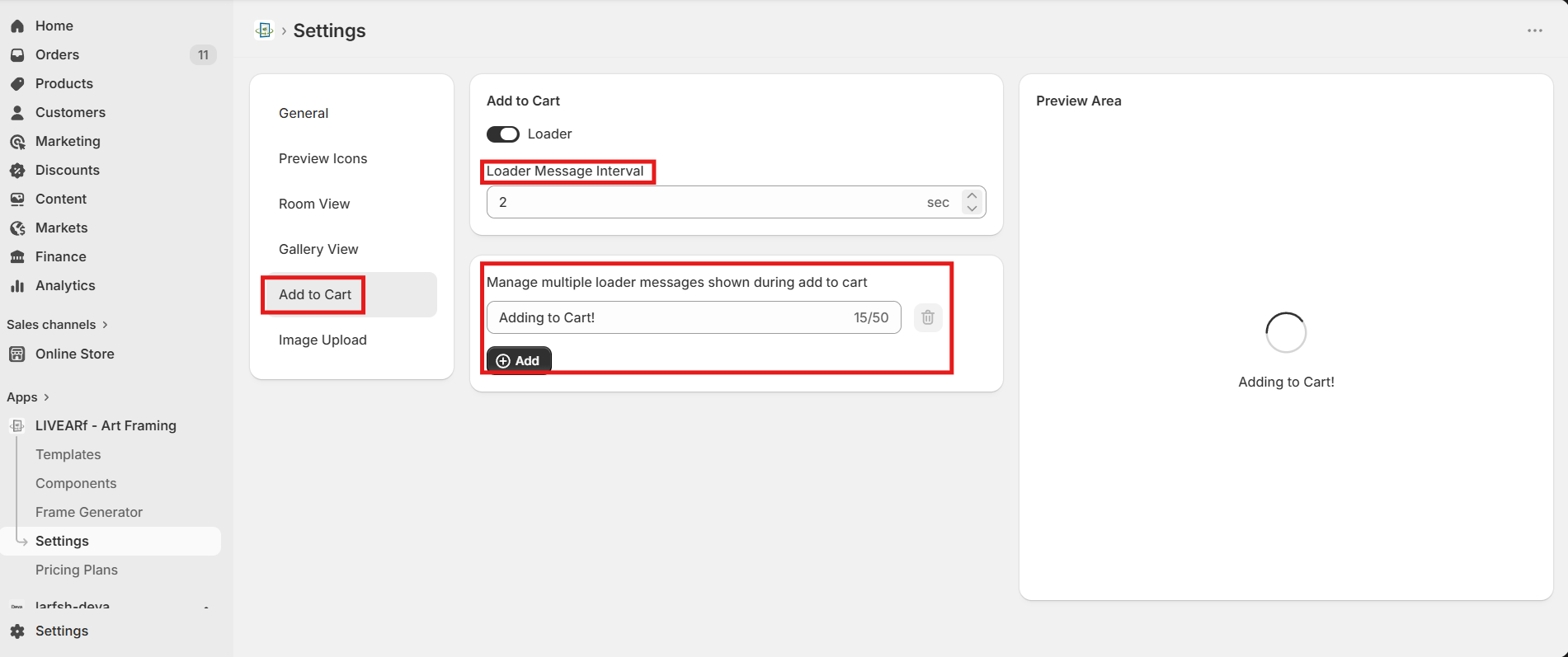 ***
| Setting | What it does |
| --------------------------- | -------------------------------------------------------------------- |
| **Loader** | Toggle ON to show an animated spinner during the add-to-cart process |
| **Loader Message Interval** | How long (in seconds) each message is displayed before rotating |
| **Loader Messages** | Custom text messages shown while the product is loading |
Click **Add** to create a new message. Each message can be up to 50 characters. Messages rotate at the interval you set.
**Example messages:**
* Adding to Cart!
* Preparing Preview!
* Uploading Artwork!
* Generating Frame Preview!
Keep messages short and reassuring. Customers are more likely to wait through a loader when they can see something happening.
Controls PPI (pixels per inch) quality validation when customers upload their own images. Prevents low-resolution uploads from being submitted for printing.
***
| Setting | What it does |
| --------------------------- | -------------------------------------------------------------------- |
| **Loader** | Toggle ON to show an animated spinner during the add-to-cart process |
| **Loader Message Interval** | How long (in seconds) each message is displayed before rotating |
| **Loader Messages** | Custom text messages shown while the product is loading |
Click **Add** to create a new message. Each message can be up to 50 characters. Messages rotate at the interval you set.
**Example messages:**
* Adding to Cart!
* Preparing Preview!
* Uploading Artwork!
* Generating Frame Preview!
Keep messages short and reassuring. Customers are more likely to wait through a loader when they can see something happening.
Controls PPI (pixels per inch) quality validation when customers upload their own images. Prevents low-resolution uploads from being submitted for printing.
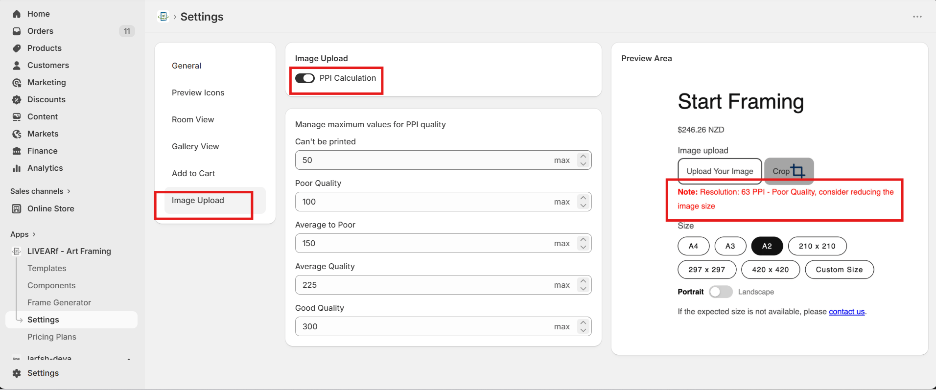 ***
Toggle **PPI Calculation ON** to enable automatic quality checking on every uploaded image.
### Quality Thresholds
| Quality Level | Default Max PPI | Result for customer |
| -------------------- | --------------- | ------------------------------------------- |
| **Can't be printed** | 50 | Blocked — image too low resolution to print |
| **Poor Quality** | 100 | Warning message shown |
| **Average to Poor** | 150 | Warning message shown |
| **Average Quality** | 225 | Advisory message shown |
| **Good Quality** | 300 | No warning — image accepted |
**Example customer-facing message:**
> *"Resolution: 63 PPI – Poor Quality, consider reducing the image size."*
If PPI Calculation is OFF, low-resolution images are accepted without any warning. Keep this toggle ON for all stores that accept customer image uploads to avoid poor-quality print orders.
***
## What's Next?
Understand how your monthly plan is calculated.
Configure frame and mat options for your products.
***
Toggle **PPI Calculation ON** to enable automatic quality checking on every uploaded image.
### Quality Thresholds
| Quality Level | Default Max PPI | Result for customer |
| -------------------- | --------------- | ------------------------------------------- |
| **Can't be printed** | 50 | Blocked — image too low resolution to print |
| **Poor Quality** | 100 | Warning message shown |
| **Average to Poor** | 150 | Warning message shown |
| **Average Quality** | 225 | Advisory message shown |
| **Good Quality** | 300 | No warning — image accepted |
**Example customer-facing message:**
> *"Resolution: 63 PPI – Poor Quality, consider reducing the image size."*
If PPI Calculation is OFF, low-resolution images are accepted without any warning. Keep this toggle ON for all stores that accept customer image uploads to avoid poor-quality print orders.
***
## What's Next?
Understand how your monthly plan is calculated.
Configure frame and mat options for your products.